In the fall of 2023, I was commissioned by a local musician named Horace Young, the bass player for a Tulsa-based death core metal band named Strength in Agony, to develop a logo concept that they could use on posters, flyers, and album covers. This commission just so happened to line-up perfectly with a mid-term assignment for my Photoshop class, which was to create an album cover utilizing original assets and various high-quality stock photos.
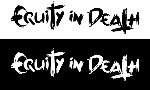
When Mr. Young first approached me, the band was still in it’s infancy and had not yet finalized their name. At this early stage, the name they were leaning towards was “Equity in Death.” Inspired by trash metal bands such as Whitechapel and Gojira, I approached these inital designs from a more handmade, horror-based perspective. Focusing on the word “equity,” I started my design exploration by designing a custom letterform based on the greek symbol for epsilon, sometimes used in mathematics to represnt "element-of." Using an old round paint brush and acrylic ink, I sketched the letterforms on heavyweight paper designed for mixed media, placing extra emphasis on retaining any sharp, dry brush marks I created. I then scanned the pages and vectorized them in Adobe Illustrator, assembling the best pieces from each scan into a single, cohesive wordmark.
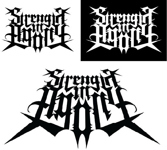
Shortly into the process, Mr. Young informed me that the band had settled on a different name: “Strength in Agony.” I quickly realized that this change necessitated a completely different design approach: whereas the previous name lent itself to a more handcrafted, horror-based style, I felt that the name “Strength in Agony” called for a stronger, more grounded approach. I started by searching for a strong, modular, sans-serif typeface to use for the base, eventually settling on a custom Barbedwire typeface designed by Billy Argel Fonts. While this first attempt was a strong start, I didn’t think that it quite captured the look or the feel that I was going for.
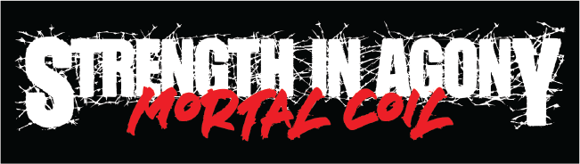
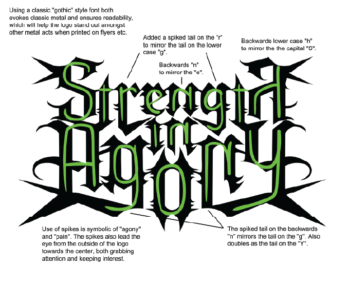
For this new logo/wordmark, my goal was to create something that speaks to the personality of the band and their new name on multiple levels; strong, sharp, and traditional, but without falling into the usual “death metal typeface” characteristics that have become so stereotypical of the genre. With that in mind, I decided to start from scratch one more time by developing an original typeface. The end result is a strong gothic-style typeface that utilizes long, symmetrical lines as pillars to reflect the concept of “strength,” adorned with sharp angles and edges that are evocative of the word “agony,” while also drawing the eye from the edges towards the center of the logo.
After finishing the logo, I just had to see how it would look on an actual album. The following album covers are fictional: the band had just started recording when they first commissioned me, and had yet to name any of their songs by that point, let along any full albums. That said, Strength in Agony have utilized the logo I created for them since their inception, using to it to promote both their shows and their recently released single Ode to Kachinga (available on Spotify, Apple Music, and YouTube).
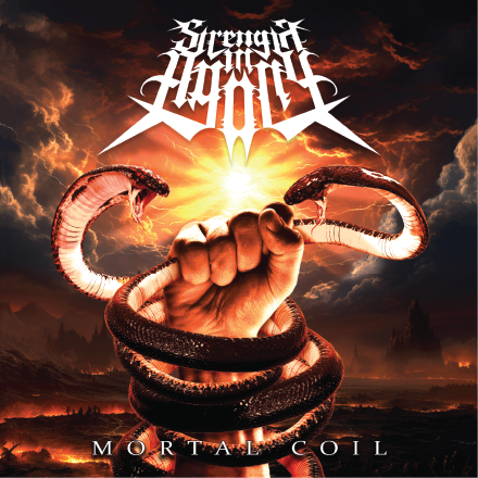
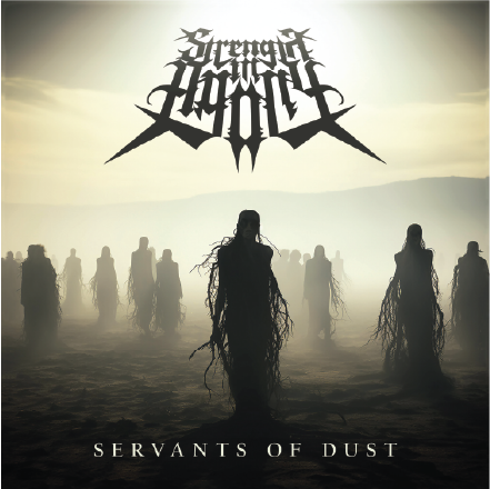
This was the first opportunity I had to work on an album cover, and I had a blast doing it. In fact, I had so much fun that I created two different mock-ups for the assignment: Mortal Coil and Servants of Dust.
For Mortal Coil, I pulled heavily on some of the most metal influences I could think of: Ronnie James Dio and Ozzy Ozbourne. I was also heavily influenced by the artwork of the artist Frank Frazetta. Known for his hyper-realistic oil paintings of popular sword & sorcery characters that graced numerous book covers, posters, and heavy metal album covers, throughout the 60’s, 70’s, and 80’s, Frazetta’s work is synonymous with the heavy metal music genre.
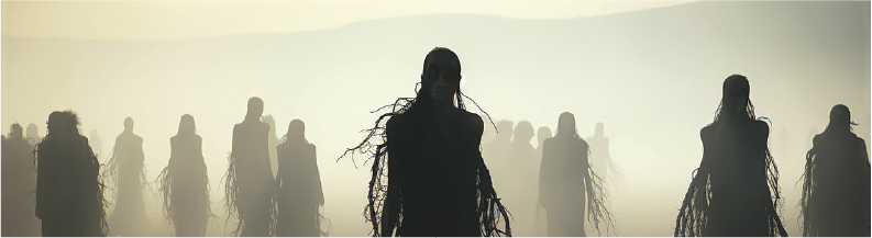
For the cover design of the fictional album Servants of Dust, I decided to go in a slightly different direction. I wanted this album to have a desolate feel; more post-apocalypse than hellfire and brimstone. I was heavily influenced by classical poetry, specifically The Hollow Men by T.S. Elliot and Ozymandias by Percy Bysshe Shelley.
The artwork for both album covers was composited using stock photos and artwork available in Adobe Stock, utilizing multiple filters and blend modes. For these works specifically, I decided that the SIA logo worked better at an angle, as if the viewer is looking up at a giant, monolithic structure hovering above the scene.